The previous years served as a turning point for the entire world. Industries changed and evolved, and so did trends in fashion. With consumers shifting toward a stronger focus on health and healing, it’s time for new palettes to dominate the catwalk.
A/W 23/24 will see subtle pastels evolve into brighter and energizing hues while nature-inspired darks take over classic neutrals. Dive into five outstanding A/W active color trends for huge sales boosts this season.
Table of Contents
Overview of the activewear market
5 A/W active color trends that make sense in 23/24
Final words
Overview of the activewear market
In 2021, the global activewear market surpassed expectations and crossed US $303.44 billion. But that’s not all. Experts predict the market will keep expanding at a compound annual growth rate (CAGR) of 5.8% from 2022 to 2028. The industry attributes its impressive growth to the increasing shift toward using modern clothing for workouts and other physical activities.
Although 2020 spelled doom for the global activewear market, 2021 provided a surge that propelled the industry to new heights. Factors still driving its growth include the increasing health awareness among the younger generation and millennials and the rising influence of social media on fashion.
Interestingly, the women’s segment shot towards a dominant position in 2021, generating over 60% of the total revenue share. Although falling slightly behind, experts expect the men’s category to see a boost at a 4.8% CAGR over the forecast period.
North America registered the largest revenue share, accounting for over 35% due to the increasing popularity of trendy activewear. Asia-Pacific seems to be growing fast, as experts anticipate a speedy 8.1% CAGR for the region.
5 A/W active color trends that make sense in 23/24
1. Digital lavender
Not all hues fall out of trend. Digital lavender is one of the many hues crossing over from S/S 23 to make a scene in A/W 23/24. The palette creates a bridge connecting the virtual and natural worlds.
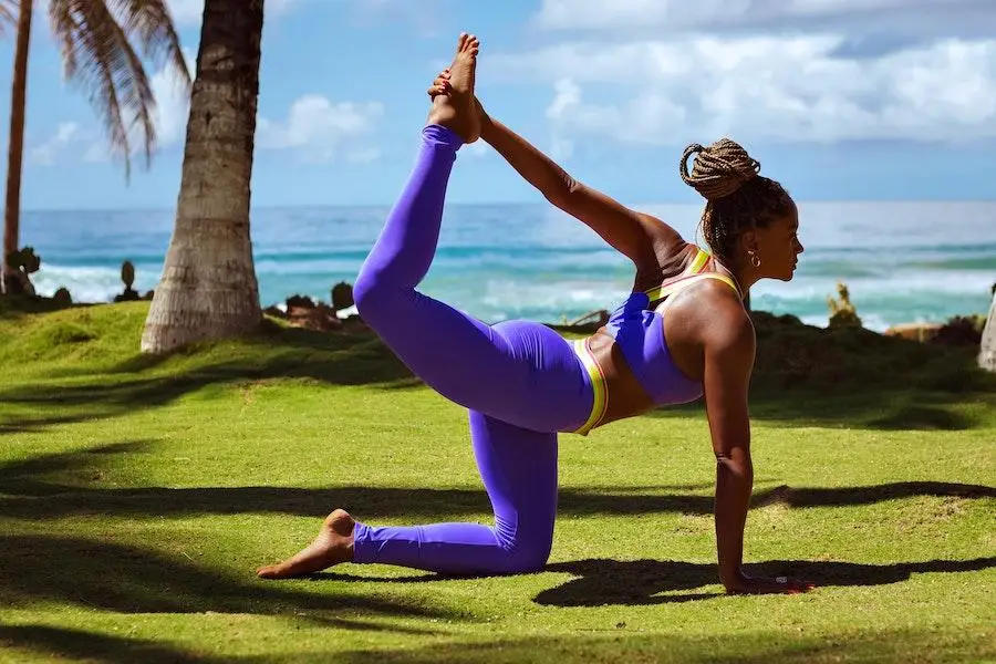
Digital lavender embraces the techy side of the metaverse while maintaining a regal and natural appeal. Activewear dipped in this hue exudes a subtle yet elegant aesthetic perfect for various physical activities.
Mixing digital lavender with browns makes a heavenly combo for technical materials. Alternatively, consumers can take a softer approach by combining the techy with other purple shades like mindful mauve and dusted grape.
But how does this hue look with other shades? Thankfully, digital lavender makes an eye-catching combo with grounded tones, like wholegrain and sepia. Think of combining a digital lavender bra top with sepia leggings. Or, a digital lavender puffer jacket with a wholegrain-colored hood.
2. Natural hues
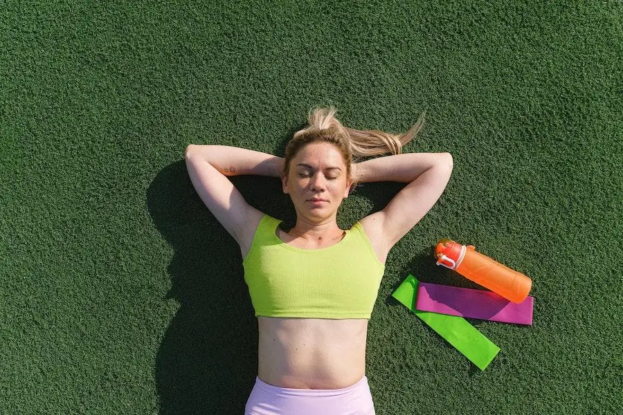
Most colors go beyond looking amazing. In truth, consumers can tap into the therapeutic benefits of interacting with nature by indulging in natural hues. Greens and neutrals can help harness nature’s therapy and will continue providing balance in A/W 23/24.
Time to swap out the classic black for some nature-inspired tones. Dark oak feels just as versatile, but with a more earthy aesthetic. The grounded shade looks fantastic on fleece jackets and classic tees. And consumers can take a more daring approach with dark oak pants.
Sage leaf takes all the natural qualities of green and adopts a grayish tone. Interestingly, the natural hue offers a restorative and multifunctional aesthetic when paired with pink clay and pumice. Sage leaf also doubles as a seasonal neutral and feels fantastic on leggings and oversized tees.
Circular gray offers a less moody tone than classic gray hues. They make fabulous combos with the dull bay leaf shade, especially on long sleeve tees and paneled track pants.
3. Darker tones
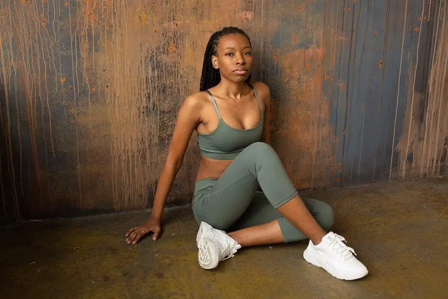
Longevity and versatility will drive consumer demand this season, increasing the importance of darks beyond the standard black. Wearers can enrich timeless classics by rocking them in rich, darker tones.
Dark oak makes another appearance as a popular alternative to black. This deep brown hue is incredibly versatile, allowing it to match various activewear pieces like leggings, bra tops, and utility jackets.
Dark cherry is another hue that emerges as a deeper alternative to bright red, making it perfect for long-sleeve tees and biker shorts. Murky green, oceanic, and midnight blue enrich this trend and can serve as neutral substitutes.
In addition, darker tones can make eye-catching designs. Some items may combine galactic cobalt with astro dust for subtle yet mesmerizing prints and patterns. Also, single colors work better for core staples and investment pieces.
4. Autumnal brights
Energizing and comforting hues are making rounds this season, making autumnal brights worthy of attention. Rich and indulgent are words best describing these vitamin-infused colors. Interestingly, these shades are gaining more ground as consumers become more intentional and optimistic.
Autumnal brights bring warmth to relaxing comfort wear. For starters, crimson makes a perfect shade for cotton tees and shorts. These bright beauties even infiltrate winter base layers and sportswear.
An interesting combination includes matching carambola, pineapple, and cranberry juice shades. Think of matching a pineapple-colored zip-up jacket with carambola paneling and cranberry-juice-colored joggers. It’ll create a perfect blend of streetwear and athleisure aesthetics.
Autumnal brights also make fantastic pairs with darker tones. Pairing these opposing colors would make head-turning contrasts, allowing any outfit to stand out.
5. Uplifting orange
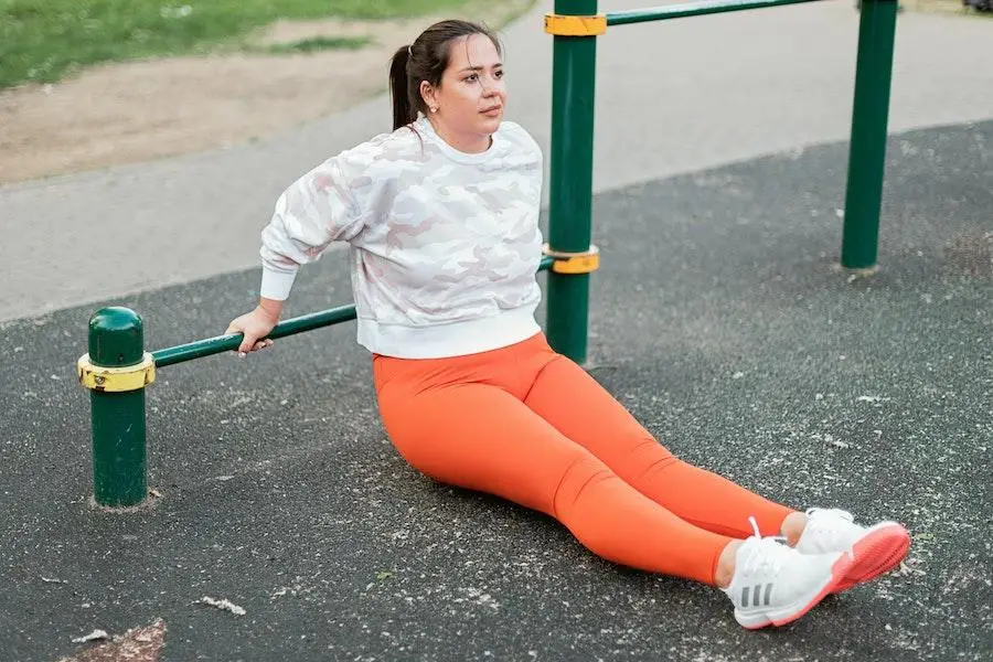
Uplifting orange grabs the spotlight to inspire wellness. As healing and healthy mindsets continue gaining consumer attention, mindful pastels will lead the way for these hues to inspire wearers in A/W 23/24.
These colors are ideal for pieces with soft and tactile surfaces. Uplifting orange can easily inspire positive and proactive mindsets during physical activities or lounge time. Consumers can rock candied orange hoodies with pink clay vests for a perfect balance between subtle and energizing.
Apricot crush, chalk, and basalt are other hues under this trend with an incredible appeal. They’ll look dashing in jackets, sports tights, and tank tops.
Final words
Colors have a strong connection to consumer emotions, and retailers can leverage that link to attract more customers. Capitalize on colors that offer longevity and versatility while minimizing environmental impact.
Attractive hues should also have gender fluidity and enough appeal to destroy preconceived color associations. Digital lavender, natural hues, darker tones, autumnal brights, and uplifting orange are the A/W active color trends to stock up for in 23/24.

