
Color plays a central role in setting the vibe of a space. Whether it is a home, an office, or a social unit – the way it looks inside can create a solid impact on people’s moods and behaviors. This article shares insights on Common Connections, one of WSGN’s forecast trends for spring/summer 2025.
The core purpose of this trend is to connect people with their culture, heritage, and a sense of who they are with designs revolving around society and politics.
Let’s look at the different themes of this trend that will be in rage this year, including some tips on making the most of them!
Table of Contents
The main concept of Common Connections
7 trending themes of Common Connections
1. Functional basics
2. Boho nautical
3. Practical blocking
4. Disrupted mid-tones
5. Warm amber
6. Summer crafts
7. Pastel splash
Steps to implement Common Connections
Final thoughts
The main concept of Common Connections
The Common Connections trend emphasizes meaningful designs that highlight individuality. Its purpose is to create an interior aura that improves lives in tangible ways. Designs in this trend celebrate personal identity, heritage, and culture while also encouraging understanding and connection with diverse communities and their traditions. This dual focus makes the designs both personal and inclusive.
The versatile appeal of this trend adds to its aesthetic element. It includes innovative and polished designs as well as raw, imperfect ones. And this blend of modern innovation with nostalgic factors results in fresh, one-of-a-kind designs.
In a world that doesn’t stop for anyone, Common Connections shows how designs can connect people. It intends to introduce interior designs that could heal and unite people. And belonging to society, politics, or culture can indeed make people feel positive and admired.
7 trending themes of Common Connections
This trend has a palette that’s practical yet playful. Although many colors repeat from other themes, they take a whole new direction when used in this trend. Check out the top picks for S/S 25:
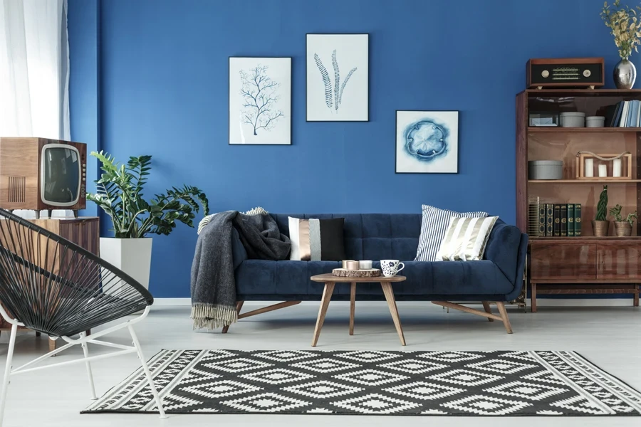
1. Functional basics
Blues and browns are classic colors that symbolize practicality. This season, they get a fresh twist by focusing on light and natural materials like wood, stoneware, and untreated fibers.
The standout color for S/S 25 is Tea Stain. It is a soft, brown shade balanced by bright ice blue. Darker shades can be added to the mix for depth and structure, but try to keep the application simple. Even rough finishes like stained, diluted, or handmade textures should look natural and effortless.
2. Boho nautical
The boho nautical trend updates the traditional bohemian themes with a nautical twist. Patterns and color-blocking with geometric designs make this theme fresh and dynamic.
Those looking to move away from the usual blues and whites should definitely explore shades like Tea Stain and Panna Cotta. These tones work well with Optic White, Unbleached Cotton, Sunset Coral, and Ice Blue for a more layered color scheme. For a softer alternative to bright crimson, try Intense Rust, which adds warmth without being overly loud.
3. Practical blocking
Put simply; practical blocking combines multiple colors in one area of a room. It is used to create a visually striking effect and add some vibrancy to a space. People can personalize the spaces and showcase their unique style through subtle shades or bold color choices.
This season, try to focus on colors that work all year round. Carefully pick the shades that seem to be sustainable. This ensures they remain relevant across different seasons, making them relevant for extended use.
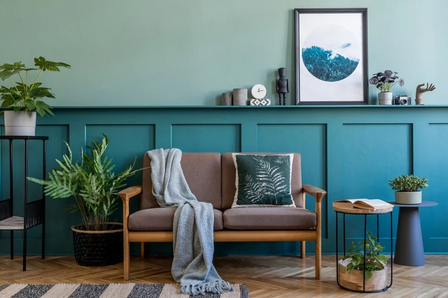
4. Disrupted mid-tones
Retro influence continues to play a major role this year. Gold and Warm Amber will remain the hot ones this season. The emphasis is on luxurious finishes like velvet, gloss, lacquer, and metallic accents.
Improvise vintage mid-tones by adding unexpected pops of vibrant colors like Sunset Coral, Electric Indigo and Crimson. Use black and off-white for sharp, graphic contrasts. For greens, opt for fresh and lighter shades like Chartreuse and Sage Green to align with the new season.
5. Warm amber
Amber color palettes can transform décor by adding charm and comfort. Layering multiple wood grains conveys a cozy and timeless appeal.
Combine the sunlit hue of Panna Cotta with Warm Amber, Tea Stain, and deep red-brown shades. These colors, with their artisanal and lived-in appeal, create a rich and inviting palette. There is also an option to use amber tones in accent pieces like rugs, throw pillows, or wall art to create an inviting atmosphere. Moreover, pairing amber with neutral colors can balance the space and highlight the vibrant shades in a room.
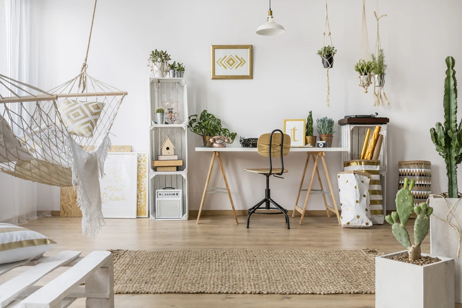
6. Summer crafts
Summer crafts celebrate lively and colorful hues. It transitions from the muted tones of A/W to vibrant S/S shades. The trend draws inspiration from Anton Laborde, who is an Indian-born and Bordeaux-based cabinetmaker. His intricate marquetry designs revolve around wooden landscapes using soft and shimmering colors.
Pair brighter tints with more subdued shades to create striking contrasts. This approach works particularly well in busy patterns with an organic aesthetic. It adds a dynamic yet harmonious feel to any space.
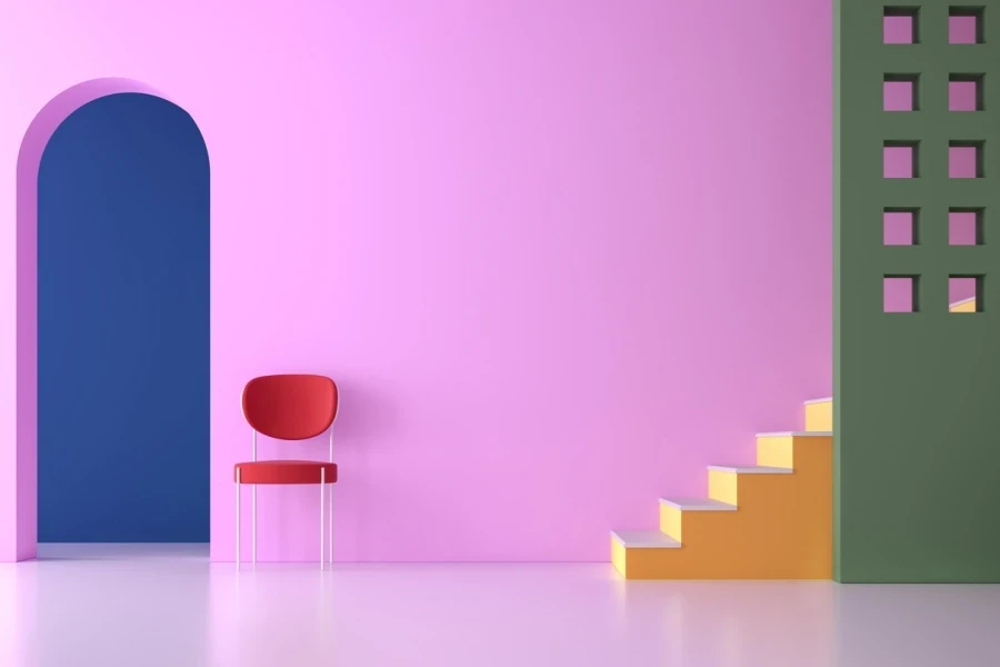
7. Pastel splash
Pastel splash is all about creating summer vibes. It is perfect for a poolside or nostalgic theme. The trend draws inspiration from Benetton’s vibrant homeware collection. It reinvents classic pastels with a bold touch, creating fresh and lively designs.
These pastels are far from subtle, so use them in large, matter, and powdery areas with a sorbet-like texture. Go for colored transparencies to mimic the juicy look of ice lollies. Tranquil Blue mirrors the brightness of summer skies, while pops of Aquatic Awe, Crimson Red and Electric Kumquat add energy and modernity to the palette.
Steps to implement Common Connections
Knowing actionable steps can help to foster collaboration, inclusivity, and shared values. Here is how to bring this concept to life:
- Identify shared themes: Research overlapping values through surveys or focus groups. Take inspiration from cultural, historical, or natural connections.
- Use visual elements: Use cohesive colors, textures, and inclusive patterns. Try blending classic and modern designs to appeal to a broader audience.
- Go for a cross-platform approach: Infuse Common Connections into designs, branding, and campaigns. Make sure the messaging stays consistent across every platform.
- Collaborate with professionals: Outsource tasks to professional artisans and communities. Celebrate shared values through partnerships.
- Be flexible: Collect feedback and change strategies for a better resonance with trends.
The world of interiors is always fluctuating. This trend of Common Connection predicts that people are willing to return to a cultural and laid-back atmosphere. Investing time and money into this domain can be quite fruitful for all stakeholders if they follow the right strategies.
Final thoughts
A good starting point is to determine the overall feel of a space. Selecting a specific theme and then choosing all shades and furnishings according to it requires research. S/S 25 will witness people embracing simplicity with a twist of personality. Focus on clean lines, clutter-free spaces, and innovative ideas to add a visual interest.
As the demand for Common Connections grows, businesses in the interior sector should offer different themes to stay ahead of the industrial competition. The evolution of trends this year reflects a solid chance of growth. Keep following Chovm Reads for more updates!


 বাংলা
বাংলা Nederlands
 English
 Français
 Deutsch
 हिन्दी
 Bahasa Indonesia
 Italiano
 日本語
日本語 한국어
한국어 Bahasa Melayu
 മലയാളം
 پښتو
پښتو فارسی
فارسی Polski
 Português
 Русский
 Español
 Kiswahili
 ไทย
ไทย Türkçe
 اردو
اردو Tiếng Việt
 isiXhosa
 Zulu
Zulu