As an online retailer, staying on top of colour trends is critical for curating an appealing and balanced assortment. For Spring/Summer 25, blues are emerging as the commercial backbone, while neutrals and darks are evolving to meet unwavering consumer demand. In this buyer’s briefing, we’ll dive into the key men’s colour trends and share insights on how to strategically incorporate them into your offering.
Table of Contents
1. Ray flower shines bright
2. Lived-in whites gain versatility
3. Luminous reds pop with energy
4. Luxe pastels soften masculinity
5. Timeless blues become transseasonal
6. Chartreuse greens engage youth
7. Sunbaked neutrals artfully age
8. Summer darks seduce with depth
9. Aquatic tones make waves
10. Orange glows with self-expression
Ray flower shines bright
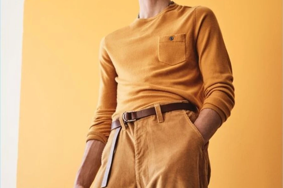
Amid ongoing challenges, consumers are seeking colours that provide respite and relief. The bright, nourishing hue Ray Flower aligns with this need, serving as a key colour for Spring/Summer 25. While yellow currently has a small share of the mix, increasing interest in items like yellow linen and polo shirts indicates rising demand. Incorporate this activating shade in washed and natural dyed essentials, active and outdoor pieces, and as pops in suiting to capitalize on the trend.
Lived-in whites gain versatility
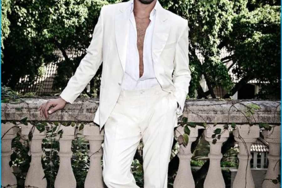
White is diversifying into a spectrum of pre-loved and off-white tones, reflecting a shift towards sustainability and longer garment lifespans. Unbleached Cotton and Chalk are joining the palette to capture gentler manufacturing processes. Build on the commercial success of neutrals by expanding into layered, tonal off-white looks in oversized silhouettes and rich textures. Laundered cotton essentials, lace and translucent fabrics, and pyjama-inspired sets offer strong opportunities.
Luminous reds pop with energy
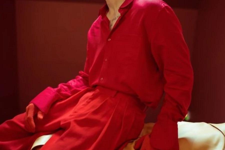
Vibrant reds are evolving to meet enduring demand for joy and pleasure. Fiery Flame and escapist Sunset Coral are key additions that enhance the luminous quality of the color. Invest confidently in reds for sport-influenced themes like resort, soccer, and preppy styles. Incorporate sheen with satin and silk-like fabrics, and play into the “pop of red” trend with layering pieces and varsity jackets to energize assortments.
Luxe pastels soften masculinity
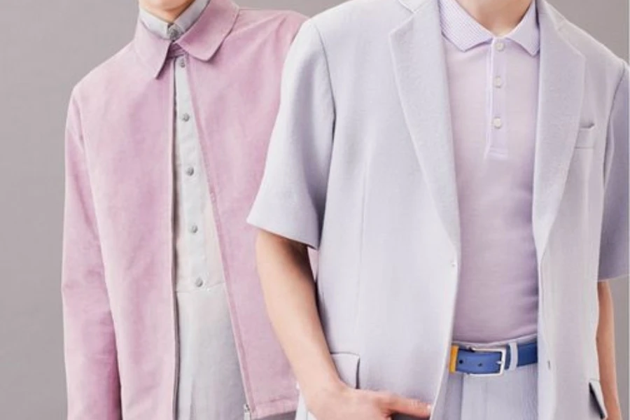
Luxe pastels are pioneering a redefinition of masculinity, with cooling Bio-Mint, Ice Blue and buttery Panna Cotta enhancing the hues’ comforting appeal. The new neutral Transcendent Pink is a key addition. Ribs, delicate knits and quilting augment the soft palette, especially for modern workleisure. Nostalgic charm can update polos and retro sport jerseys, while linen-blend suiting and softened utility tap into key themes.
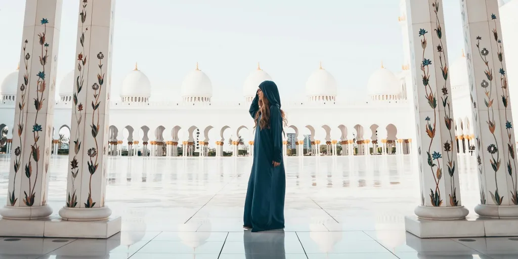
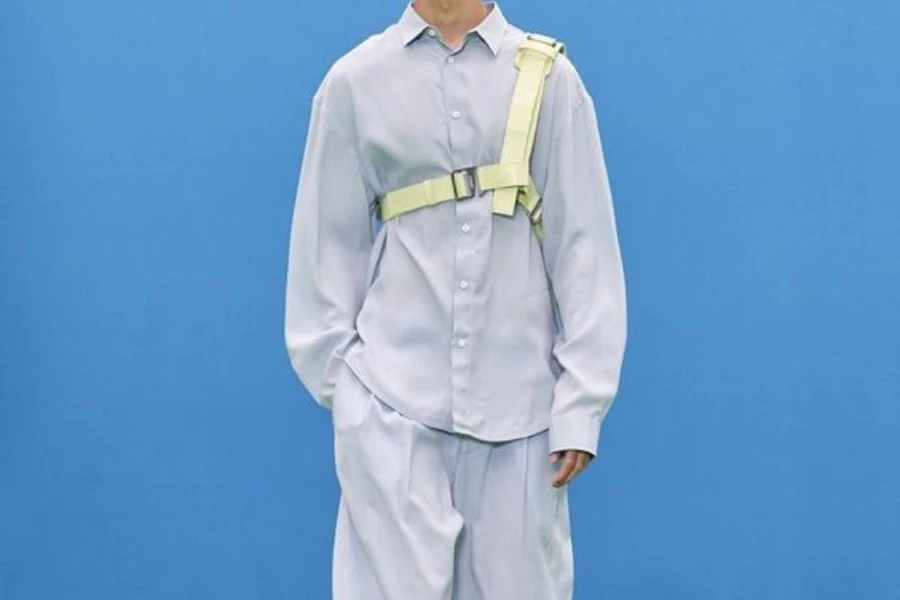
Timeless blues become transseasonal
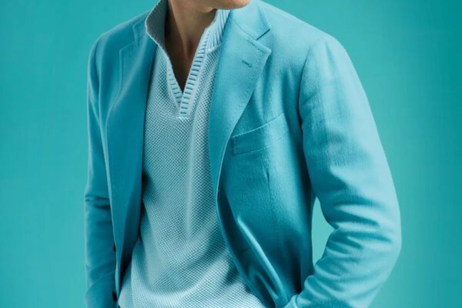
As thrift culture hits the mass market and consumers prioritize versatile classics, blues are surpassing greens in popularity. Timeworn indigo shades like Retro Blue, Honest Indigo and Borrowed Blue have strong potential as core colours. Update commercial nautical resort stories with laundered finishes, pinstripes and collection essentials. Reimagined shirting and back-to-business tailoring provide additional opportunities to rework menswear codes.
Chartreuse greens engage youth
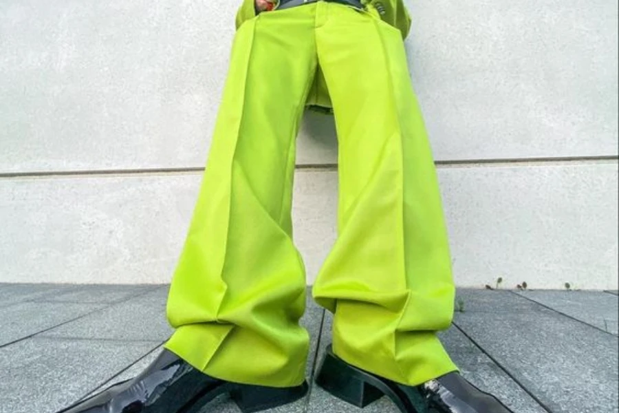
While greens remain commercial, innovative bio-diverse shades like zesty Chartreuse will add excitement and resonate with younger consumers. Merchandise it boldly with bright Radiant Raspberry and Meta Mauve for outdoor explorer appeal. Use it to re-merchandise between seasons and cater to festival-goers with bio-washed denim, summer sweats and resort shirts.
Sunbaked neutrals artfully age
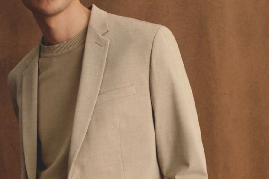
A saturated neutral market is evolving with baked hues like pinkish Italian Clay and nostalgic Sunbaked. Seersucker, bouclé and sueded fabrics enhance the artisanal feel, while washed graphic tees provide a holiday heirloom vibe. Matching neutral sets offer consumers foundational mix-and-match value. With strong sales and declining markdowns, incorporate fresh sunbaked shades to update dependable neutral offerings.
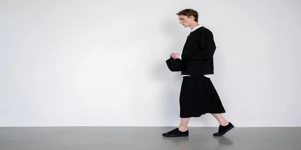
Summer darks seduce with depth
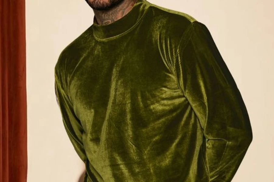
Versatile, transseasonal darks are gaining ground, with The New Darks trend forecast to have a lasting impact. Future Dusk, Midnight Plum, Dark Moss and Ground Coffee create an alluring shadowy palette. Use for suiting, especially casual linen and lightweight options. Merchandise as a base for bright footwear and accessories pops. With black still dominating and brown driving sellouts, diversify core darks for fresh outfit-building appeal.
Aquatic tones make waves
Immersive, transformative aquatic hues like Aquatic Awe and Blue Lagoon align with shifting wellness attitudes and digital spaces. These bioluminescent tones are suited for active, outdoor and print applications. Fluid minimalist styling enhances the breezy feel for premium positioning. Knitwear essentials like prep vests and knit tees work the gentle retro resort angle. Strong retail data indicates aquatic blues are poised to perform.
Orange glows with self-expression
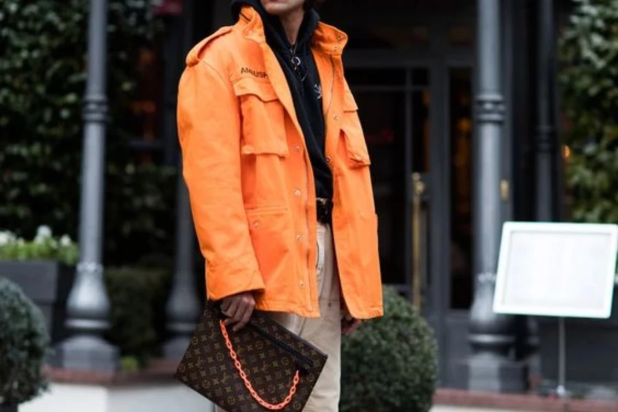
Solar-inspired, juicy orange brights like Warm Amber and Electric Kumquat will amplify Spring/Summer 25’s exuberant mood and grow into A/W 25/26. The psychedelic glow resonates with lush AI-inspired dreamscapes. While orange currently has a small footprint, strategic incorporation in youth-oriented oversized graphics, hybrid festival designs and activating sport leisure will deliver seasonal sizzle.
Conclusion
As you develop your Spring/Summer 25 men’s assortment, balancing the season’s key colours will be essential for meeting evolving consumer demand. By strategically incorporating blues as a commercial anchor, enlivening neutrals and darks with baked and shadowy tones, and energizing with luminous reds, luxe pastels and juicy oranges, you can create an appealing colour mix. Stay attuned to key application areas to make the hues resonate, from artisanal fabrics to active and outdoor. With this buyer’s briefing as your guide, you’re well-positioned to curate a winning Spring/Summer 25 colour palette.
Read more: Shades of Style: Decoding the Essential Colors for Spring/Summer 2025 Womenswear