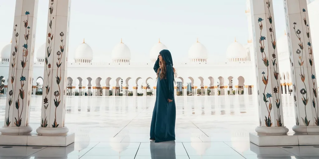
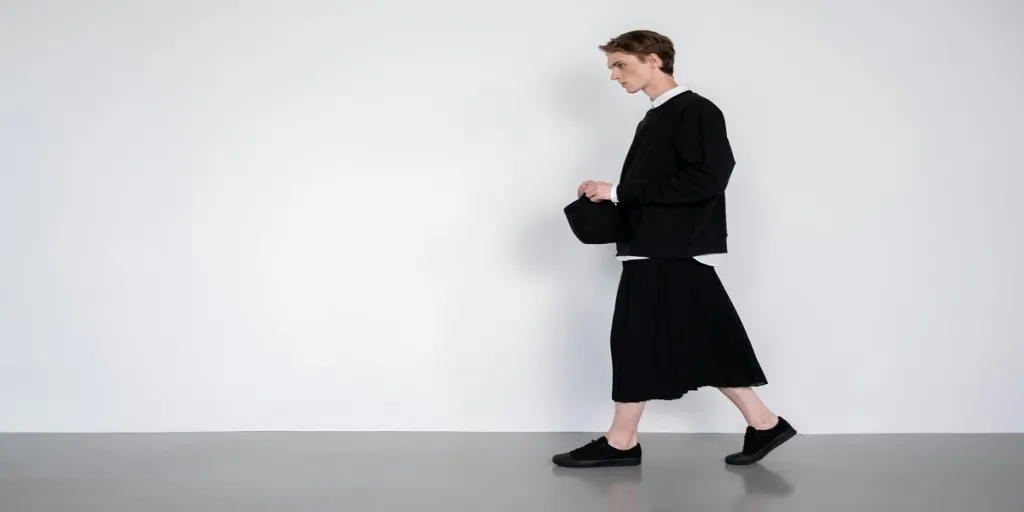
As we look ahead to Spring/Summer 2025, the fashion world is set for a vibrant color revolution. This season brings a refreshing shift in the palette, balancing warm hues with a resurgence of cooler tones. Teal and aqua shades make a comeback, bridging the gap between blue and green, while summer brights take center stage with high-chroma oranges, yellows, and blues. Expanding long-term shades, particularly neutrals and grays, add depth and versatility to the palette. This evolution in color trends offers exciting opportunities for product development and design innovation. This article explores how key color groups will transform over the next two years, providing insights to inspire your creative process and keep your offerings fresh and appealing.
Table of Contents
● Red renaissance: From primary to coral
● Orange evolution: Balancing bright and warm
● Yellow spectrum: Calming pastels to chromatic hues
● Green diversity: Fresh cool to natural tones
● Blue horizons: Aqua to electric indigo
● Purple progression: Lavender to hyper-violet
● Pink perspectives: Soft blush to vibrant fuchsia
● Brown tones: Earthy neutrals to rich chocolate
● Gray gradients: Cool stones to warm taupe
● Conclusion
Red renaissance: From primary to coral
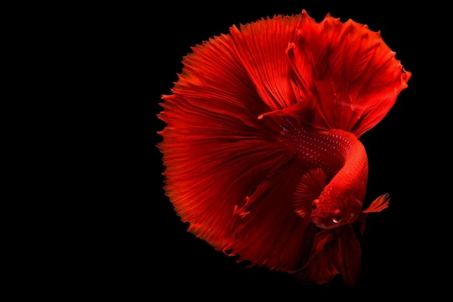
Red is undergoing a renaissance for S/S 25, evolving from primary hues to embracing softer coral tones. At the forefront of this evolution is Sunset Coral (009-58-31), a hue that signals the return of coral-based shades. This warm, inviting color brings a fresh vibrancy to collections, perfect for creating eye-catching pieces that embody the spirit of summer. It’s versatile enough to be used in everything from casual wear to accessories, adding a touch of warmth and energy to any design.
Complementing the coral trend, Crimson (010-38-36) maintains its position as a long-term chromatic shade. Its enduring presence in the palette speaks to its versatility and timeless appeal. Cranberry Juice (008-26-26) steps in as the darkest red of the season for those seeking depth and intensity. This rich hue is ideal for creating bold statements or serving as a sophisticated design accent. Combining these reds, from coral to Crimson to cranberry, provides a well-rounded palette that can be mixed and matched to create stunning, on-trend pieces for the S/S 25 season.
Orange evolution: Balancing bright and warm
Orange continues evolving in the S/S 25 palette, striking a captivating balance between bright and warm tones. The return of Electric Kumquat (028-67-41) and Flame (016-49-37) heralds the importance of highly chromatic shades in the orange family. These vivid hues inject a burst of energy into designs, perfect for creating standout pieces that capture the essence of summer. Electric Kumquat brings a zesty, almost neon quality, while Flame offers a bold, attention-grabbing warmth. These colors are ideal for making a statement in both clothing and accessories.
Warm Amber (026-51-32) balances out these intense shades, a grounding mid-tone that adds depth and sophistication to the orange palette. This rich, earthy hue is a versatile anchor, complementing the brighter oranges while standing strong. Warm Amber can create more subdued, elegant pieces or as a harmonizing element in multi-colored designs. The interplay between these vibrant and warm orange tones offers endless possibilities for creating dynamic, seasonally appropriate collections.
Yellow spectrum: Calming pastels to chromatic hues
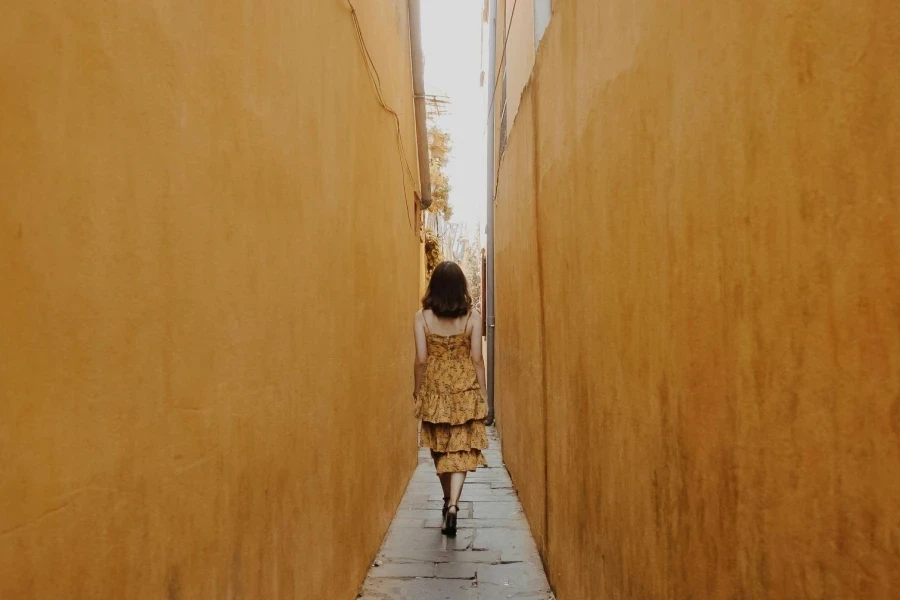
The yellow spectrum for S/S 25 presents a harmonious journey from soothing pastels to vibrant chromatic hues. Panna Cotta (038-86-20) returns as a calming pastel at the softer end of the spectrum. This delicate shade evokes a sense of tranquility and lightness, perfect for creating pieces that exude a gentle, approachable aesthetic. It’s an ideal choice for lightweight fabrics and summer essentials that convey a sense of serenity and comfort.
Moving along the spectrum, Ray Flower (037-82-32) emerges as a more vibrant option, bringing a chromatic punch to the palette. This lively yellow infuses designs with energy and optimism, making it excellent for statement pieces or bold accents. Rounding out the yellow family is Tea Stain (030-66-22), a grounding and natural hue that bridges the gap between pastel and chromatic. This versatile shade adds depth and warmth to designs, working well in both standalone pieces and as a complementary color in multi-hued creations. The interplay of these yellows offers a rich tapestry of possibilities, from serene and subtle to bright and bold.
Green diversity: Fresh cool to natural tones
Green plays a diverse role in the S/S 25 palette, offering a spectrum ranging from fresh, cool tones to rich, natural hues. The reintroduction of teal, represented by Aquatic Awe (086-70-25), brings a refreshing coolness to the green family. This vibrant shade evokes images of clear waters and summer skies, making it perfect for creating pieces with a breezy, maritime feel. Aquatic Awe can be used in clothing and accessories to add refreshing color to summer collections.
Deep Emerald (079-26-18) emerges as a sophisticated natural tone on the other end of the green spectrum. This rich, luxurious hue adds depth and elegance to designs, ideal for creating pieces with a more refined and timeless appeal. Cool Matcha (055-85-20) is Bridging these two extremes, a light and fresh green that adds a serenity to the palette. This versatile shade works well in airy summer garments or as an accent color, bringing a sense of calm and natural beauty to designs. The interplay of these diverse greens allows for creative combinations that suit various styles and preferences.
Blue horizons: Aqua to electric indigo
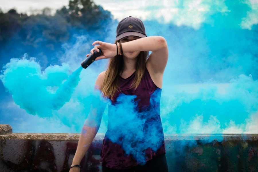
The blue palette for S/S 25 expands into exciting new territories, offering a spectrum that ranges from refreshing aqua to intense electric indigo. Leading the charge into fresher territory is Blue Lagoon (103-63-26), a vibrant aqua shade that evokes images of tropical waters and clear summer skies. This refreshing hue is perfect for creating standout pieces that embody summer’s carefree spirit. It works particularly well in swimwear, resort wear, and accessories, adding refreshing color to any collection.
Balancing the palette is the return of Tranquil Blue (114-57-24), a versatile mid-tone that bridges the gap between seasons. This adaptable shade can be used across various product categories, from casual wear to more formal pieces. Electric Indigo (120-32-36) makes a bold statement at the intense end of the spectrum with its saturated punch. This electrifying hue is ideal for creating eye-catching accents or statement pieces that demand attention. The combination of these blues, from soothing aqua to intense indigo, offers a rich tapestry of options for designers to explore, allowing for the creation of dynamic and seasonally appropriate collections.
Purple progression: Lavender to hyper-violet
The purple palette for S/S 25 showcases a striking progression from soft lavender hues to bold, hyper-violet tones. Meta Mauve (134-55-24) continues as a gentle, approachable shade at the softer end of the spectrum. This versatile hue works well in various applications, from casual wear to accessories, adding a touch of refined elegance to any piece. Its soothing quality makes it an excellent choice for creating tranquil, relaxing designs that resonate with those seeking a sense of calm.
Moving along the purple spectrum, Future Dusk (129-35-18) emerges as a deeper, more mysterious shade. This blue-based purple brings a sense of depth and sophistication to designs, perfect for creating statement pieces or adding an air of intrigue to accessories. At the most vibrant end, Hyper-Violet (143-47-32) bursts onto the scene with its intense, saturated hue. This electric shade is ideal for bold accents or standout items that demand attention. The interplay between these purple tones allows for creative combinations, from tonal looks to high-contrast pairings, offering endless possibilities for innovative and eye-catching designs.
Pink perspectives: Soft blush to vibrant fuchsia
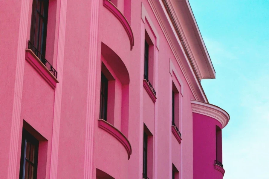
The pink palette for S/S 25 offers a delightful journey from soft, understated blush tones to vibrant, attention-grabbing fuchsias. Blush Pink (003-80-15) returns as a gentle, romantic shade at the softer end of the spectrum. This delicate hue adds a touch of femininity and warmth to designs, perfect for creating smooth, approachable pieces that exude elegance and grace. It works particularly well in lightweight fabrics and lingerie collections.
Moving along the pink spectrum, we encounter Bubblegum Pink (004-65-35), a playful and energetic mid-tone that bridges the gap between soft and bold. This lively shade injects fun and youth into designs, making it ideal for casual wear and accessories. At the most intense end, Electric Fuchsia (005-50-45) makes a bold statement with its vivid, saturated hue. This dynamic shade is perfect for creating standout pieces or adding punchy accents to otherwise neutral designs. The interplay between these pink tones allows for creative combinations ranging from subtle and sophisticated to bold and daring.
Brown tones: Earthy neutrals to rich chocolates
The brown palette for S/S 25 showcases a rich array of earthy tones, ranging from light, neutral shades to deep, luxurious chocolates. Sand Dune (045-80-15) emerges as a versatile neutral at the lighter end. This warm, sun-kissed shade evokes images of beach landscapes, making it perfect for summer collections and transitional pieces. Its neutrality lets it pair easily with vibrant hues and other earth tones.
Moving deeper into the brown spectrum, we find Cinnamon Stick (030-40-35), a spicy mid-tone that adds warmth and sophistication to designs. This rich hue works well in both clothing and accessories, offering a touch of earthy elegance. At the darkest end, Bitter Chocolate (030-20-20) provides a luxurious depth to the palette. This intense brown is ideal for creating statement pieces or adding a touch of refinement to any design. The range of these brown tones allows for creating sophisticated, nature-inspired looks that can easily transition from season to season.
Gray gradients: Cool stones to warm taupe
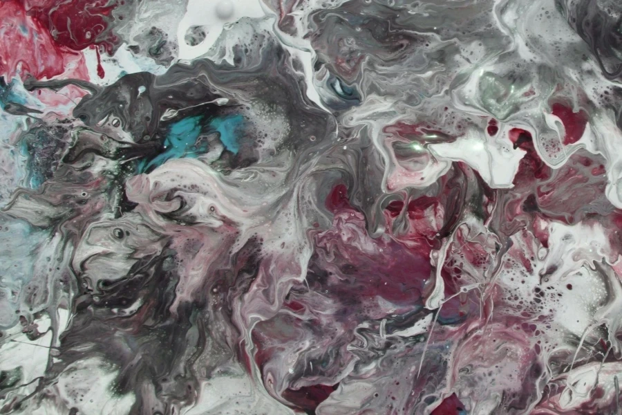
The gray palette for S/S 25 presents a nuanced range of tones, from cool, stone-like hues to warmer, taupe-inspired shades. Granite Grey (000-45-00), a classic, neutral grey that evokes the solidity of stone, leads the cool end of the spectrum. This versatile shade is an excellent base for layering other colors or can stand alone for a sleek, minimalist look. It’s particularly effective in tailored pieces and accessories.
In the mid-range, we find Silver Mist (000-65-00), a lighter gray with a hint of luminosity. This ethereal shade adds a touch of sophistication to designs, working well in casual and more formal applications. Dove Taupe (045-65-05) is warming up the gray palette, a subtle blend of gray and brown that bridges the gap between cool and warm neutrals. This adaptable hue is perfect for creating soft, approachable pieces that can easily transition between seasons. The interplay of these gray tones provides a solid foundation for building diverse and seasonally appropriate collections.
Conclusion
As the S/S 25 season approaches, the color palette presents a captivating blend of evolution and innovation. Each hue group offers exciting possibilities for creative expression, from the red Renaissance to the purple progression. The balance of warm and cool tones and the expansion of long-term shades provide a versatile foundation for diverse designs. By embracing these color trends, designers and brands can create timely and timeless collections. As the fashion world evolves, these color insights serve as a valuable guide for crafting products that resonate with the spirit of S/S 25 and beyond.

