Color is a fundamental element of our lives; as well as giving clues as to objects in our environment, it can also convey emotions and alter our moods. For this reason, the benefits of surrounding ourselves with different colors, especially inside our homes, are increasingly understood.
But while many people love color, we still tend to choose neutral interiors. Why? Mostly because we are afraid of choosing the wrong combinations. For this reason, professionals across various industries use color wheels to select colors in a way that creates harmonious combinations.
For example, color wheels are an essential tool for fashion experts, graphic and floral designers, architects, and interior designers. They provide a practical way to mix and match colors, ensuring that every design is visually appealing. In this article, we’ll provide a deeper understanding of this practical instrument and how it can be used to enhance various projects.
Table of Contents
The origin of the color wheel
How to use a color wheel chart
Conclusion
The origin of the color wheel

Before choosing furniture, decorations, clothing, or accessories, it’s important to consider the elements and feelings you might want the items to convey. Color wheel charts are therefore a fundamental tool to guide you in developing and harmonizing color choices.
Great scientists, artists, and philosophers throughout history have created a range of color theories. For example, Johann Wolfgang von Goethe wrote about the opposition of complementary colors, while the Bauhaus painter, designer, and teacher Johannes Itten created the color wheel chart in 1919.
Itten’s work focussed on the relationship between one color and another, showing how secondary colors and tertiary colors can be generated from primary colors. He also used this method to highlight various harmonious combinations, dividing colors into groups of four colors following a squaring pattern.
How to use the color wheel chart

Professionals in many industries use some version of color wheel charts daily. Because of the different variations, it’s important to understand as much as you can about this instrument so that you can offer the right one to different professionals depending on their specific work.
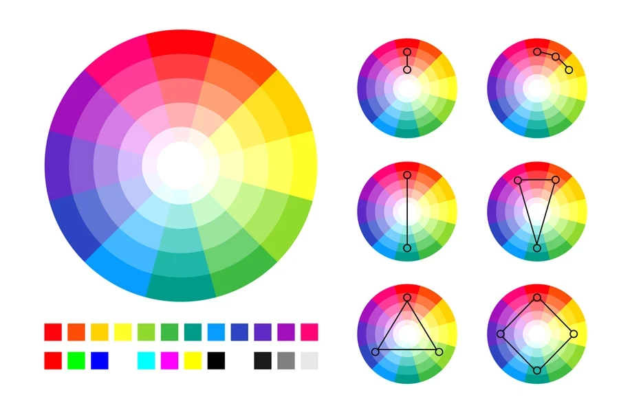
In general, a color wheel chart is made of two paper disks connected in the center by a metal point that allows the disks to rotate. The lower disk displays the 12 colors and their combinations, shades, and tones, while the upper disk contains descriptions and technical information on how to interpret them. This structure and functionality are designed to enhance professionals’ comprehension of the tool.
For example, where it says “tint,” white has been added to the color; where it says “tone,” gray has been added; and where it says “shade,’ black has been added. This way, it’s easier to understand that when you combine, for example, two complementary colors, you do not necessarily have to use purely red and green. Instead, you can choose, for example, a desaturated red and combine it with dark green in the quantity that you wish.
And while professionals may use different techniques to attain different results, the basic principle behind the color wheel chart is remarkably simple and unchanging. This can help boost your confidence and help you better understand the tool to create harmonious color combinations.
Analogous colors

Analogous colors (which can be divided into warm and cold colors) are adjacent on the wheel and, therefore, have similar shades. Analogous color schemes are often found in nature, resulting in harmonious and pleasing-to-the-eye combinations..
Fashion and interior designers use this technique to create various soothing, calming, and serene color palettes.
Complementary colors

These are the colors that fall on the exact opposite sides of the wheel. They are the most difficult to use because they create a strong contrast, which is not always easy to manage.
High-contrast complementary colors give life to a lively look, especially when used at full saturation, and must be combined carefully so as not to be jarring. While complementary color schemes are often applied sparingly in more outlandish interiors, they are often the bread and butter of fashion and graphic designers.
Triadic colors

These color palettes are the three colors on the chart connected by a triangle.
Professionals start with the main color they want to use and then turn the wheel so that the vertex of the triangle matches that color, selecting the two other colors that match the first.
This technique is very common in interior design, where designers follow the rule of “60-30-10” to distribute different colors and achieve the perfect balance in homes and apartments.
It’s particularly important to pay attention to the saturation and brightness of the colors, leading to another important aspect of the color wheel chart:
Saturation and brightness
A proficient color wheel chart should not only show pure colors, but also saturation and brightness.
Saturation determines how “pure” a color is: The more saturated it is, the closer it is to this purity, while the more desaturated it is, the closer it is to gray.
On the other hand, brightness determines how light or dark the color is. The more white you add, the lighter it becomes; the blacker you go, the darker the color is.
It is essential to consider these variables when selling color wheel charts wholesale, as professionals often require varieties that allow them to choose the right shade (pure color), saturation, and brightness depending on the result they want to obtain.
Conclusion
For retailers, offering the right color wheel chart is an opportunity to meet a critical need in various creative industries. By understanding the key features of the color wheel, such as its ability to guide color harmony, balance saturation, and adjust brightness, you can provide professionals with a tool that helps to enhance their work.
Stocking high-quality, versatile color wheel charts that cater to specific professionals will aid in your journey to becoming a trusted resource for fashion experts, interior designers, and other creatives.


 বাংলা
বাংলা Nederlands
 English
 Français
 Deutsch
 हिन्दी
 Bahasa Indonesia
 Italiano
 日本語
日本語 한국어
한국어 Bahasa Melayu
 മലയാളം
 پښتو
پښتو فارسی
فارسی Polski
 Português
 Русский
 Español
 Kiswahili
 ไทย
ไทย Türkçe
 اردو
اردو Tiếng Việt
 isiXhosa
 Zulu
Zulu